Sign in to FlowVella

Forgot password?
Sign in with Facebook

New? Create your account

Sign up for FlowVella

Sign up with Facebook

Already have an account? Sign in now


By registering you are agreeing to our
Terms of Service

Share This Flow

Loading Flow

loading...

Downloading Image /

loading...

Downloading Image /

loading...

Downloading Image /

loading...

Downloading Image /

loading...

Downloading Image /

loading...

Downloading Image /

loading...

Downloading Image /

loading...

Downloading Image /

loading...

Downloading Image /

loading...

Downloading Image /

loading...

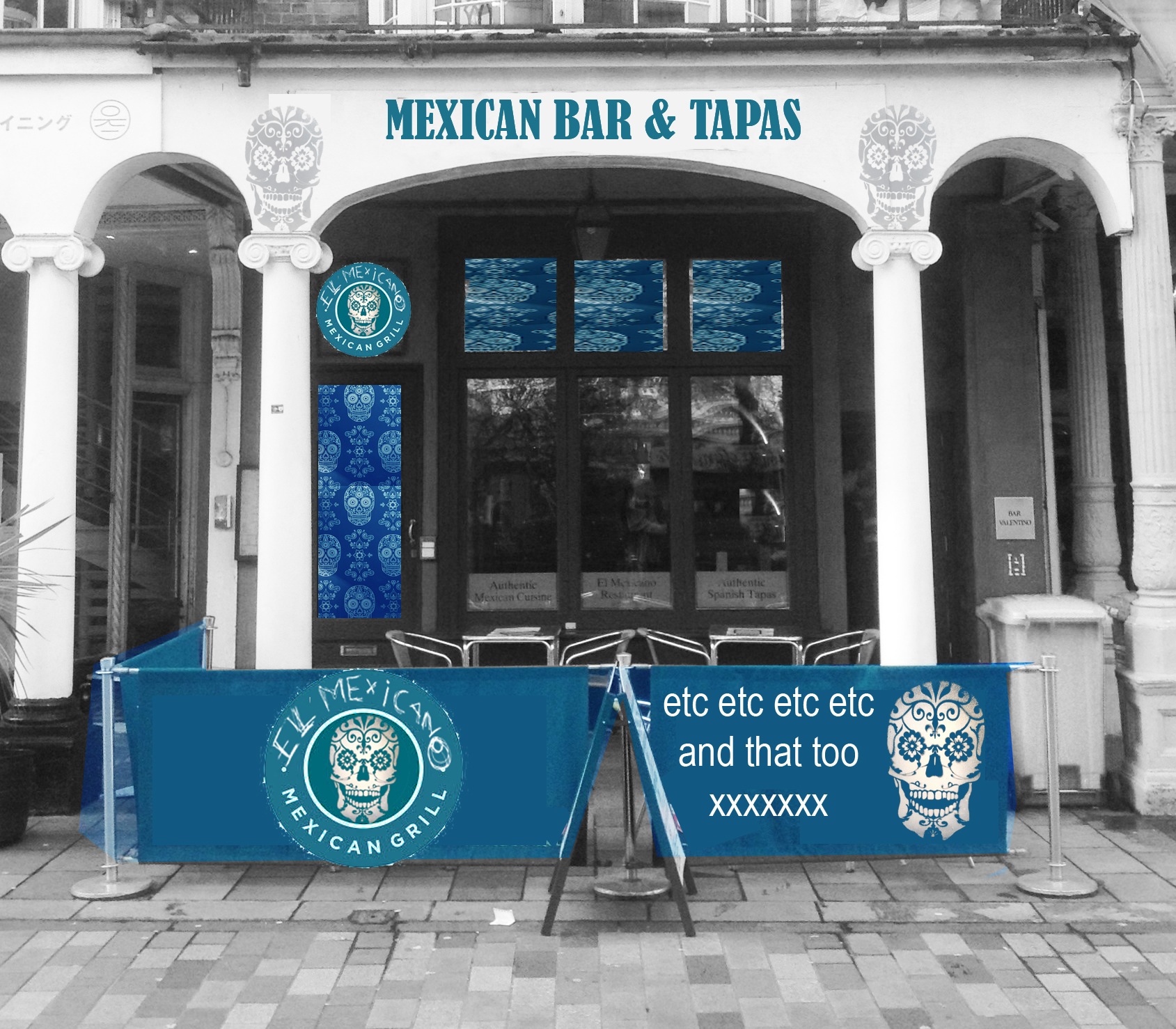
Exterior facade-Bright accent option
White and grey scheme with turquoise and teal accents creates an uncluttered clean and striking look. The new graphics combined with the graffiti skull motif on interior walls (visible from the outside) create visual continuity. Note that this visual is for project design purposes only as the graphics need exploring and developing as a separate project.

Fire heaters and new exterior furniture will be planned separately

Downloading Image /

loading...

Downloading Image /

loading...

Downloading Image /

loading...

Downloading Image /

loading...

Downloading Image /

loading...

Downloading Image /

loading...

Downloading Image /

loading...

Downloading Image /

loading...

Downloading Image /

loading...

Downloading Image /

loading...
  • 1

  • 2

  • 3

  • 4

  • 5

  • 6

  • 7

  • 8

  • 9

  • 10

  • 11

  • 12

  • 13

  • 14

  • 15

  • 16

  • 17

  • 18

  • 19

  • 20

Sarah's Interior design schemes

By Sarah Gillings AKA SOS

This is an interior design and rebrand scheme for a well established Brighton UK restaurant, El Mexicano, who has been trading for over a decade. The business requires an uplift, a breath of fresh air and a new direction in order to bring more customers in as well as increase their spend and enjoyment of the space.