Sign up for FlowVella
Sign up with FacebookAlready have an account? Sign in now
By registering you are agreeing to our
Terms of Service
Loading Flow

Downloading Image /
Downloading Image /

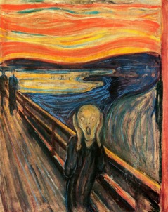
Artist: Edvard Munch
Title: The Scream
Date: 1893
Medium: Tempura on cardboard
Currently: National Museum of Art, Architecture and Design, Oslo
Source: http://nationalmuseum.no
Human Emotions
Describe: Munch used colors between blue and orange, two complementary
colors. He used thick and thin lines and some are curvy while others are straight. He emphasized different parts of the paintings by the major contrasts of color. Everything but the bridge is curving in some way.
Analyze: Munch used somewhat messy lines. This piece has colors from both the cool and warm schemes of the color wheel. He used two main colors, shades of blue and shades of orange: two complementary colors. There are no repeating patterns in this piece.
Interpret: Looking at this painting, I notice the expression on the man's face first. He looks to be worried, scared, nervous, etc.The lines in this painting create a feeling of anxiety. The lines are messy, not very straight in most cases, and they all vary in different sizes and colors. The way Munch drew this piece brings my eyes in a circle around the man. It starts at the water coming down to him, then I follow the straight lines of the bridge bringing my eyes to the sky that waves over to the water to start another cycle. Munch painted the man a dark blue and greenish color to show a depressed feeling and the orange and yellow in the sky to show energy.
Judge: I have always really enjoyed this piece. At a younger age, I found it to be quite comical, but now I see that it is really a little sad. I love how the painting is organized and not overflowing but is still kind of chaotic. I find the colors in this painting to be really beautiful and vibrant. This piece is by far my one of my favorite paintings.
Downloading Image /
Downloading Image /
Downloading Image /
Downloading Image /
Downloading Image /
Downloading Image /
Downloading Image /

FlowVella, Previously Known As Flowboard
© 2024 FlowVella
