Sign up for FlowVella
Sign up with FacebookAlready have an account? Sign in now
By registering you are agreeing to our
Terms of Service
Loading Flow

Downloading Image /
Downloading Image /
Downloading Image /
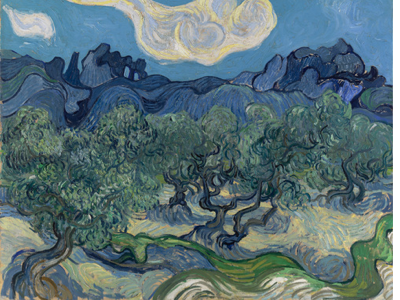
Artist: Vincent van Gogh
Title: The Olive Trees
Date: June-July 1889
Medium: Oil on canvas
Currently at the Modern Museum of Art
Source: moma.org
Description: There are green trees. Some blue mountains in the back. There is grass in the front with the trees. The sky is blue and there are white clouds in the sky. There are mostly cool colors in this painting
Analysis: The elements of art he used were line, color, and form. The principles of design he used are movement and contrast. Line is used throughout the whole painting. The element of line and the principle of movement go together. I follow all the lines swooshing lines in the trees, clouds, and grass. The cloud looks almost like it's moving the way he made the lines. I start by following the lines in the grass all the way up to the sky. Color and contrast are used together as well. On the mountains, they go from a light blue to a really dark blue. The cool colors throughout the painting give me a very calm feeling, because it's not too bright and crazy. Form is used in the painting many times. The tree, mountains, and clouds are all organic forms.
Interpretation: The painting throughout is very calm. The movement of the lines and cool colors give a calm feeling. It looks like he went on a Sunday walk and was just taking in the beauty of the calmness of the afternoon. It looks like it was a gorgeous day. The trees are a green so it must've been summer. The calm lines aren't going all crazy around the paper, they are just swooshing across, almost like waves in the ocean. It might've been a windy day by the way the cloud is gliding across the sky. The calm colors are blue and green in this picture. When I see blue and green I usually feel calm unlike when I see yellow, red, and orange.
Judgment: I really love this painting a lot. I feel like I'm there on a Sunday walk or picnic. The way everything looks makes me feel like I'm there. It's very interesting because of all the elements he used and the way he used them. I think he was successful in communicating the theme of his artwork which was a calm theme. That's what I first thought when I saw this painting.
Downloading Image /
Downloading Image /
Downloading Image /
Downloading Image /
Downloading Image /
Downloading Image /

FlowVella, Previously Known As Flowboard
© 2025 FlowVella
