Sign up for FlowVella
Sign up with FacebookAlready have an account? Sign in now
By registering you are agreeing to our
Terms of Service
Loading Flow

Downloading Image /
Downloading Image /
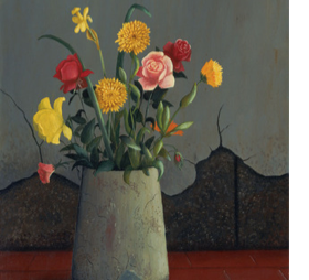
Artist: Frederick Papsdorf
Title: Flowers in a Vase
Date: 1940
Medium: Oil on canvas
Currently at the Modern Museum of Art
Source: moma.org
Description: The wall is cracked in the background. The wall is a dull gray. It looks like the vase is on a red tile floor. The vase is made of cement. The flowers are warm colors such as yellow, red, orange, and pink. The stems and leaves are green. Some of the flowers are wilted.
Analysis: The artist used the elements of line, texture, and color. The principles of design are emphasis and contrast. Line is used in making the tiles on the floor. The artist also used line in the walls where it is cracked. There are also some cracked spots on the cement vase. Texture is used between the vase and the red tiles. The vase looks very rough looking compared to the tile that looks smooth. They used texture to show a contrast between those two things. The flowers are all sorts of different colors, mostly warm colors such as red and orange. I think the artist put emphasis on the flowers because those are the only thing with color besides the tile. Everything else is a dull so it doesn't take away from the flowers.
Interpretation: The mood is sad but happy. It's sad from the dull colors in background that give me no feeling. The wilting flowers at the bottom of the flowers also gives a sad mood because they aren't straight up like the others. The mood is happy from the beautiful warm colors that give me a feeling of happiness. Warm colors are to make you feel happy because they are so vibrant. The flowers that aren't wilting are on the top, those are the ones I looked at first not the wilting ones. I think the artist did that on purpose because they didn't want you to focus on the wilting ones on the bottom.
Judgement: I really like this painting. I thought it was interesting how the artist made the flowers the only thing with color and everything else a dull color. I didn't realize that until I examined the painting more closely. I also love the detail the artist put into the flowers. The artist also did an awesome job with the use of texture. When I looking at the vase I felt like I was touching the roughness of the vase. Overall a great painting.
Downloading Image /
Downloading Image /
Downloading Image /
Downloading Image /
Downloading Image /
Downloading Image /
Downloading Image /

FlowVella, Previously Known As Flowboard
© 2025 FlowVella
