Sign up for FlowVella
Sign up with FacebookAlready have an account? Sign in now
By registering you are agreeing to our
Terms of Service
Loading Flow

Downloading Image /
Downloading Image /
Downloading Image /
Downloading Image /
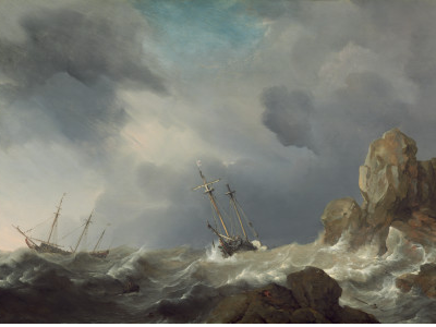
Artist: Williem van de Velde
Title: Ships in a Gale
Date: 1660
Medium: Oil on panel
Currently at National Gallery of Art
Source: www.nga.gov
Description: There are choppy waves. The ocean is a grey blue color. The sky is grey and cloudy. There are brown rocks on the right. There are boats in the water. The boats look like they are made of wood.
Analysis: The elements of art are value and form. The principles of design are movement and contrast. Value of color is in the ocean and sky. The light source from the sky is shining on the right side of the ocean so that is why the ocean is lighter on that side. On the left of the ocean, the color is dark because there is no light shining on it. Form is in the clouds because clouds are an organic form. Movement is used in the waves because the way they are drawn to look choppy which makes them look like they are moving. Contrast is used the same way value was used. The contrast in color of the ocean because of where the light source was.
Interpretation: I think the mood the artist was trying to convey was a stressed mood. I get that feeling because of the choppy waves, dark sky, and the boats moving around the ocean all crazily. There is definitely no calmness in this painting. I feel like it's almost gloomier in the back left of the painting because it's darker on that side than the other side. The contrast of color really makes a difference because it looks like on the right if they kept on sailing they would eventually find calmness. If you went deeper into the darkness on the left side it would probably go on for a while.
Judgement: I felt drawn into the work because of all the detail I felt like I was there. I find it very interesting because of how one side seems like you could keep on going and find light and the other seems like you would keep on going into darkness. I think they were successful in creating the stressed mood through the choppy waves and boats about to tip over.
Downloading Image /
Downloading Image /
Downloading Image /
Downloading Image /
Downloading Image /

FlowVella, Previously Known As Flowboard
© 2025 FlowVella
